|
|
Post by ranseur on Aug 2, 2017 4:14:47 GMT -5
|
|
|
|
Post by DieuxDesCimetieres on Aug 2, 2017 7:41:25 GMT -5
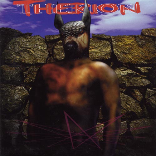
One of my fave "adventuring in the woods" -style covers:  Also a great band, the best stuff Samoth, Ihsahn and Ildjarn ever did IMO! |
|
|
|
Post by danwerneck on Aug 3, 2017 17:17:49 GMT -5
|
|
|
|
Post by mutter on Aug 11, 2017 20:08:03 GMT -5
I really find no clue of what bad about it. The same with other works you guys posted here  Have you seen how goth-girls did draw before everything went manga? This is how. I like it but it is pre-teen gothgirl styled. Yes! I love this kind of thing - it's a parade of cliche and undeveloped drawing skill, but it's a got a particular kind of charm. |
|
|
|
Post by thekeeper on Aug 21, 2017 15:00:05 GMT -5
 Not sure if this fulfills the "but is good" part |
|
|
|
Post by thekeeper on Nov 25, 2017 20:36:41 GMT -5
 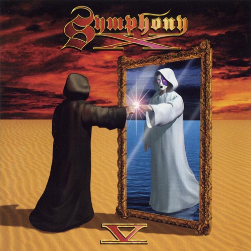 Seems like symphonic bands went for the early CGI art much more than anyone else |
|
|
|
Post by nahadoth on Nov 26, 2017 10:40:22 GMT -5
Just seeing this thread now, but that Symphony X cover is the first thing that came to mind upon seeing it. I played a lot of video games with cutscenes that looked like this in the late 90s so that one really struck a chord with me. I'll go ahead and submit the original cover for Faces of Winter, which was widely (though not entirely) panned on the FB group when I first shared the album. It's a watercolor painting that I made, and despite the reaction I still like it. But obviously I cared enough about the perception to change it (twice), first prior to uploading the album on YouTube/releasing it on cassette, then again when I started working with Canrith. I think if I were releasing this album right now, I'd be pretty confident in using art like this, but at the time I was not very confident in my visual sensibilities. 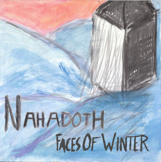 |
|
|
|
Post by nahadoth on Nov 26, 2017 10:44:16 GMT -5
This one is kind of interesting - Bernhard Gander, a modern classical composer who is seen in his bio photo wearing a Napalm Death t-shirt, and who from a distance has pieces that might be mistaken for experimental tech-death. Most of his album covers have either weird CGI or manipulated photos with some imagery that is pretty rooted in a metal aesthetic. To my knowledge he's the only composer in this field with a visual aesthetic like this. :format(jpeg):mode_rgb():quality(90)/discogs-images/R-6248894-1414741760-5815.jpeg.jpg) |
|
|
|
Post by zerointerno on Nov 26, 2017 13:03:29 GMT -5
Møntsën / «The Lie» /2017  |
|
|
|
Post by andrewwerdna on Nov 27, 2017 0:58:43 GMT -5
Haha, that one snarky-looking sun. But that's pretty cool I think, there's something vaguely creepy about it.
Also I do like that original Nahadoth cover. It's simple but unique and makes you curious about its sound.
|
|
Alder
Magic User
 Murky dungeon sounds: alderen.bandcamp.com
Posts: 228
|
Post by Alder on Nov 30, 2017 10:54:52 GMT -5
This promo pic of Rob Darken from Graveland:  "I'm slightly disappointed in you, Corpsepaint Jr." "I'm slightly disappointed in you, Corpsepaint Jr." |
|
|
|
Post by nahadoth on Dec 1, 2017 0:13:51 GMT -5
+5 for that comment.
|
|
|
|
Post by DieuxDesCimetieres on Dec 1, 2017 2:17:36 GMT -5
Then there's this one which has baffled me for years... 
"For my meat stew, I only accept the tender meat of young virgins!" |
|
|
|
Post by thekeeper on Dec 3, 2017 20:21:55 GMT -5
Most pictures of Rob Darken are goofy to some degree. The word-art really makes this one:  |
|
Erang
Verified Account
Posts: 130 
|
Post by Erang on Dec 6, 2017 3:50:53 GMT -5
I also like the singularity of the Nahadoth's Cover : to me that's completely part of the charm and uniqueness of Dungeon Synth. andrewwerdna nahadoth |
|


/about/sepultura-morbid-56b87c663df78c0b13651218.jpg)


